Last week, we broke down the VIX and how expectations of volatility can drive markets.
Continuing on the theme of expectations, today we discuss an even more powerful tool in macro finance:
The Yield Curve.
If you haven’t heard of it before, don’t worry. Today I’ll be breaking it down in simple terms.
And we have to start by understanding bonds.
We’ll cover:
How bonds work
How bonds make up the yield curve
What is an inverted yield curve
Why the yield curve is important
What the yield curve is currently telling us
While this might seem like a lot, I promise it’ll be eye-opening.
Let’s dive in.
How Do Bonds Work?
Put simply, a bond is a loan.
Imagine you want to borrow $1,000 from me.
I could buy a bond from you for $1,000. I give you $1,000 in cash, and you give me a piece of paper or certificate. That piece of paper is the bond.
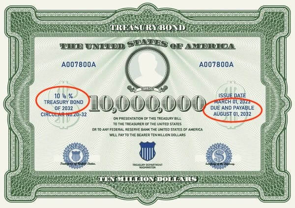
Coupon rate (interest rate) on the left, duration on the right
Now, the key to bonds is that they each have two very important characteristics:
A duration: The amount of time you are borrowing the money for
A coupon rate: The annual interest you are paying for borrowing the money
So for instance, if you want to borrow $1,000 from me for a duration of 1 year, maybe I charge you a 5% interest rate. That would be reflected on the bond (see above).
But now, what if you want to borrow $1,000 from me… but for 10 years?
You would probably expect me to charge you a higher annual interest rate (coupon) for borrowing my money for a longer period of time.
There are tons of different types of bonds – corporate bonds issued by companies, municipal bonds issued by municipalities… Yield curves exist for all kinds of bonds, but the Yield Curve commonly referenced by investors is the yield curve on bonds issued by the US government (more commonly referred to as Treasuries). And it’s worth noting that the US Treasury market is approximately $27 trillion dollars. It’s a big market.
So bonds vary by duration and that influences their coupon rate…
We can now begin to imagine a graph.
How Bonds Make Up The Yield Curve
We start by plotting the various durations on the x axis:

Bond durations.
And then we’ll plot the coupon rate as a % on the y axis.
And again, you would imagine that the interest rates would slowly increase as we move to higher durations, and that would give us a nice looking upward slope:
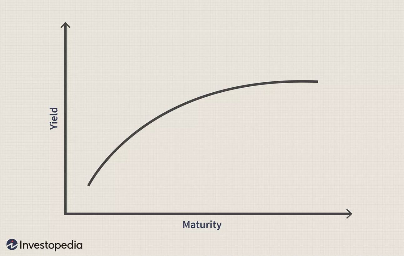
A normal, “healthy” yield curve
Side note: The interest rate on short term Treasuries is often called the “risk-free rate”. Why? Because the US is the strongest world economy, because the US is considered extremely credit-worthy, and because the US has never defaulted on their debt. If this makes you raise an eyebrow, then stay tuned… because we’ll have many more articles and videos on this topic
This is the yield curve.
And this is what the yield curve should look like.
But what if I told you that the yield curve doesn’t always look like this?
And that the actual yield curve hasn’t looked like this for over 2 years?
What is an Inverted Yield Curve?
An inverted yield curve occurs when interest rates on short term bonds are higher than the interest rates on long term bonds.
Wait, what?!
So someone expects to be paid less interest… for lending money for a longer period of time?
Yes, that’s correct.
As counterintuitive as this may seen, this situation is fairly common.
It occurs when investors expect interest rates to fall in the future, often due to concerns about economic slowdown or recession.
In other words, investors are expecting a recession.
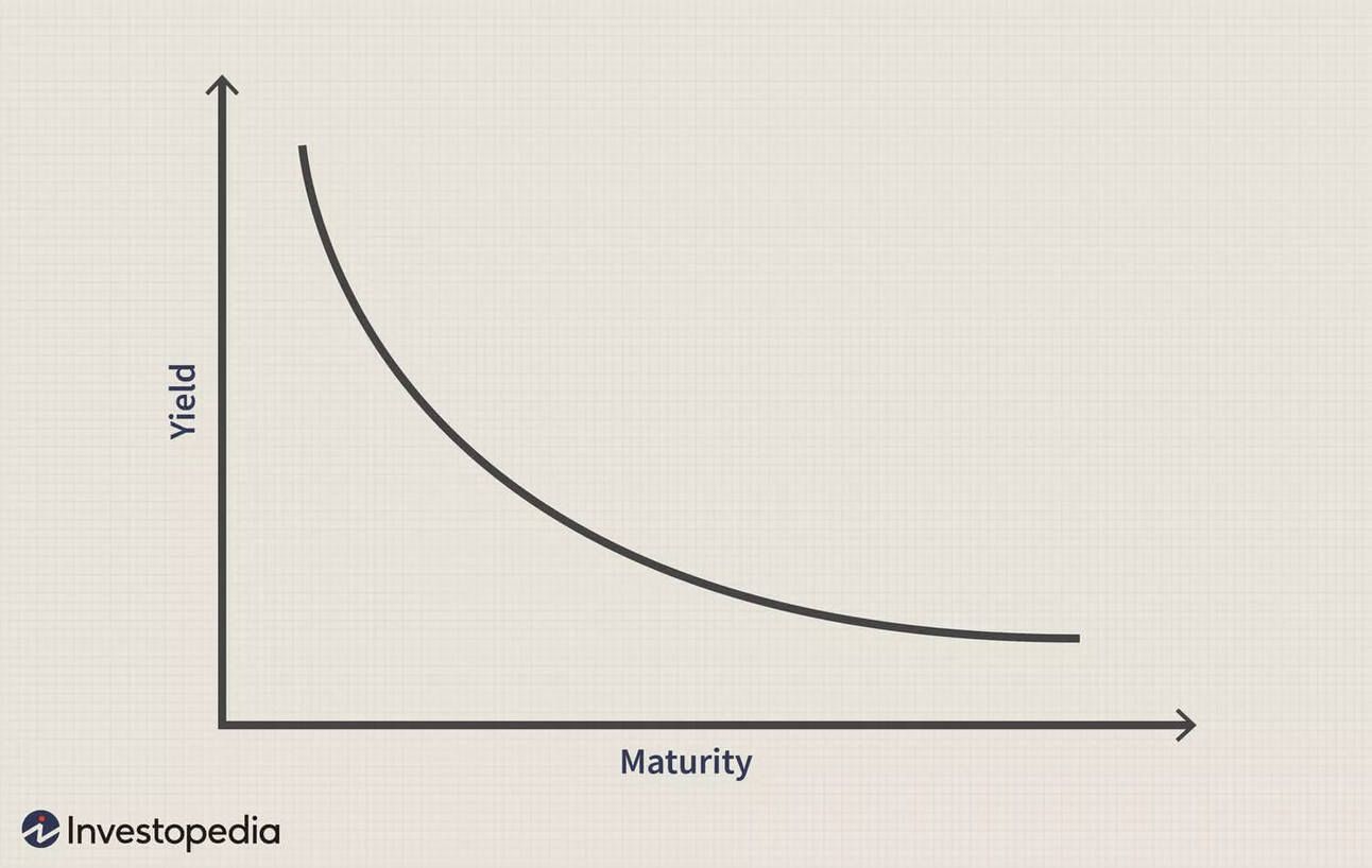
An inverted yield curve.
Visually, an inverted yield curve slopes downward from left to right, contradicting the normal upward slope where investors demand higher yields for locking up their money for longer periods.
Since there are so many durations on the yield curve, investors often look at a particular pair of durations for comparison when looking at the inversion of the yield curve. One of the most common pairs is the 10 year vs. the 2 year, also referred to as the 10-2 year “treasury yield spread”. To be precise, this is the pair that has been inverted since July 2022, but many other pairs are also currently inverted.
And as mentioned earlier, the yield curve has been inverted for over 2 years – since July 2022.
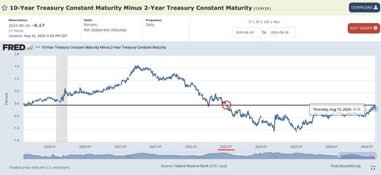
The 10-2 year spread, courtesy of FRED (a wonderful website for raw economic data). When this is <0, it means the yield curve is inverted.
Alright, great. So the curve ain’t curving.
Why does this matter, Brandon?
Why the Yield Curve is Important
When the yield curve is inverted, it tells us a lot about the economy and investors’ expectations for the economy. Specifically, it helps us answer:
How is the economy is doing? Historically, inverted yield curves have been reliable predictors of recessions. When short-term rates exceed long-term rates, it often signals economic trouble ahead.
What will the Federal Reserve do? If you think of the yield curve as a betting market, it essentially plots what investors believe the Fed will do with monetary policy – even suggesting details such as when the Fed will cut rates, and by how much they will cut rates.
What are lending conditions currently? The yield curve influences borrowing costs throughout the economy, affecting everything from mortgages to corporate loans. And in a credit-based financial system, borrowing is immensely important. Another topic for a future date
To put it simply, you can think of the Yield Curve as a financial thermometer.
So what does the Yield Curve look like today?
What the Yield Curve is Telling Us
Here comes the punchline.
If the Yield Curve is a thermometer, then it is telling us that we have a fever…
And a very bad fever.
This is the longest the yield curve has been inverted since the Great Depression.
And as mentioned earlier, the inverted yield curve is signalling the following:
A recession could be coming soon
Investors largely expect the Fed to cut rates
Inflation could remain higher for longer
However, there’s a double-whammy here…
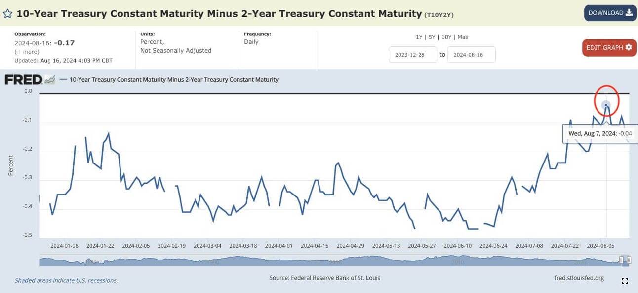
Zooming in on the same FRED graph, we can see the 10-2 pair almost went positive.
Earlier in August, the yield curve almost un-inverted. Meaning, it almost went back to normal.
That’s a good thing, right?
Not exactly.
Remember how I mentioned that an inverted yield curve generally precedes a recession?
In those scenarios, the yield curve usually un-inverts first… then a recession happens.
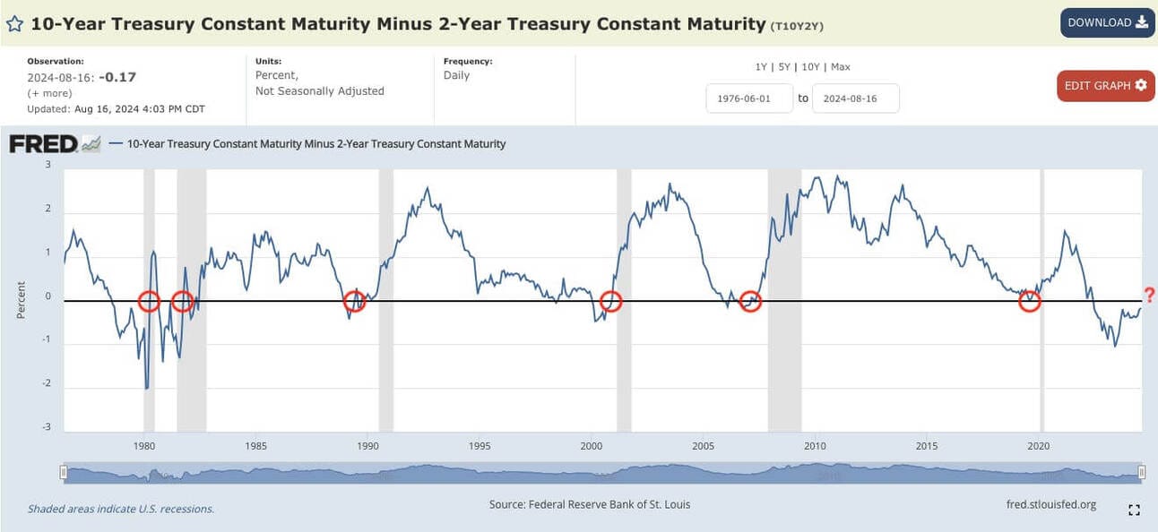
Zooming out, we can see that the 10-2 almost always goes positive just before (or in the midst of) a recession (recessions marked by the gray bars.
There’s an expression I quote often in my articles:
History doesn’t repeat, but it often rhymes.
Just because something happened in the past, does not guarantee it will happen again.
I am not suggesting you go and sell all your investments and start hoarding cash.
However, it is absolutely worth appreciating that the broad consensus among investors in a $27 trillion dollar market… is that they expect a bumpy road ahead.
How far ahead? No one knows for sure. But we’ll be watching.
Hopefully today’s article gave you a crash course on the Yield Curve. “Yield Curve 101”, if you will.
And if there’s interest in a 201 course, let me know.
PS. The topic of the yield curve was covered in last week’s video on the Wealth Potion YouTube channel:
To your prosperity,
Brandon @ Wealth Potion
Build in Public Update
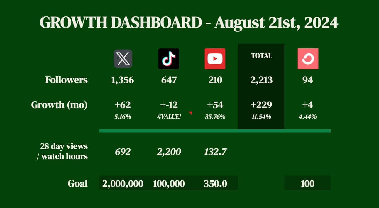
Leaving in the broken TikTok formula intentionally
My Market Crash video did great. 11x my usual video performance.
My next few videos? Not so much.
This is something that more experienced Creators are all too familiar with. I saw it first-hand with my partner as she grew her followings on Instagram, TikTok, etc.
It’s very hard to predict what content will perform well.
What’s worse, is that effort does not always correlate to performance. After the video that did well, I put even more effort into my next video, only to be disappointed by the results.
This is something I will have to get used to, and accept. It’s an interesting mental challenge.
And because I focused even more heavily on YouTube, I continued to neglect TikTok.
So now I’m faced with a dilemma of where to focus my time. I still don’t have all the answers, but I thought I’d share for any other Content Creators who are going through a similar struggle.
You can check out my two latest videos below. The first on The Creator Economy:
And the 2nd on Warning Signs of Empire Collapse:
Til next week.
Follow Wealth Potion on social media for more exclusive content:
+
If you enjoyed reading, consider forwarding to someone who would find this valuable.
You can read all our previous newsletters here.
The post The Yield Curve and Why It Matters appeared first on Wealth Potion.
